

Eastern Shore Consolidated School
Brand Identity, Mascot Design, School & Athletics System
The Challenge
Eastern Shore Consolidated School was created through the merger of long-standing local schools, bringing students together under one new roof while retiring decades of athletic history, alumni pride, and legacy team identities. The challenge was to introduce a bold new Coyotes identity that could unify the student body, honour the communities that came before it, and build excitement for a shared future without making the past feel erased.
The Solution
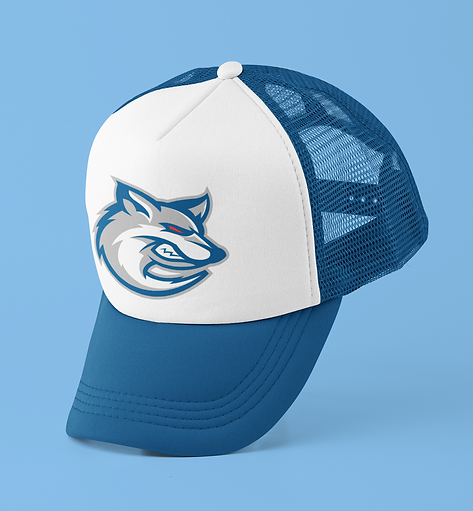
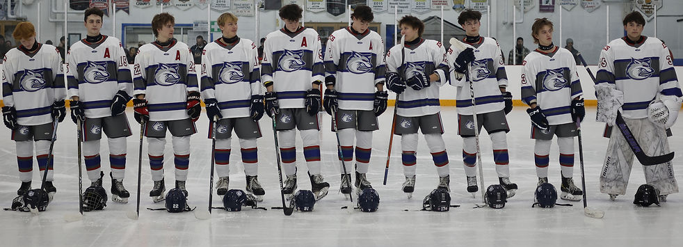
I developed a complete varsity branding system from the ground up, beginning with a bold Coyotes mascot designed to embody strength, unity, and forward momentum. The primary mark features a sharp, modern coyote head subtly shaped into a “C,” allowing it to stand alone on jerseys, integrate with athletic typography, and give the new school a confident identity students could rally behind.

Built for the Pack
The identity system extends beyond the primary mark, with distinct treatments for junior and senior varsity teams, official merchandise applications, and spirit-driven rally cries that give students something to make their own. Phrases like “Go ’Yotes,” “We Are Pack,” “This Is Coyote Country,” and “Welcome to the Den” help turn the brand into a shared language of pride, energy, and belonging.




From Hallways to Hoodies
The identity system extends beyond the primary mark, with distinct treatments for junior and senior varsity teams, official merchandise applications, and spirit-driven rally cries that give students something to make their own. Phrases like “Go ’Yotes,” “We Are Pack,” “This Is Coyote Country,” and “Welcome to the Den” help turn the brand into a shared language of pride, energy, and belonging.







One Identity for the Whole School
Beyond athletics, the brand system extends into a cohesive school-wide identity, including the official school logo, used on letterhead and business card applications. While used more formally, these pieces help connect academic, administrative, and athletic environments under one consistent visual system.
At its core, the identity reinforces a shared sense of belonging: one school, one community, and one pack moving forward together.

